LiteCommerce:FlyoutCategories
The LiteCommerce Flyout Categories add-on module lets you control the visual presentation of your categories structure. You can select from several layout schemes available in different color variations or create your own templates.
Flyout Categories enhances LiteCommerce navigation system by introducing several new styles of categories menu, and makes browsing categories convenient for your customers. The module enables you to use four major menu styles: a horizontal menu, tree-style menu (Explorer), menu with buttons (Candy) and menu with icons (Icons). Each of the major menu styles includes several variants of menu design. You are welcome to use one of the pre-designed image sets bundled with the module or create images of your own. Skin based architecture allows you to create a unique design for your menus without modifying any PHP code.
Contents
Configuring the module
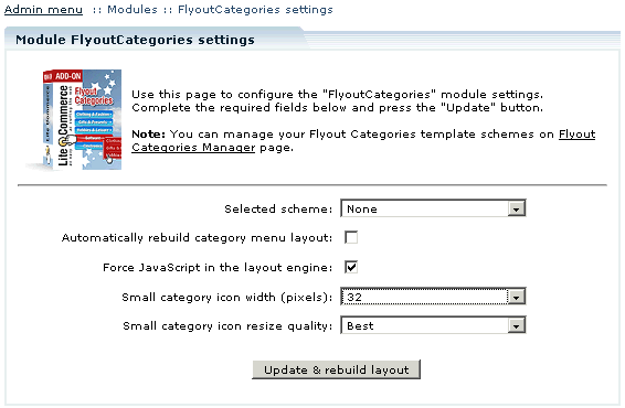
After you have successfully installed the LiteCommerce Flyout Categories add-on module, click on the Flyout Categories module name in the list of installed modules to enter the module configuration page.
Basic settings
Selected scheme: select one of predefined layout schemes. When the module is first installed none of the schemes is selected.
Automatically rebuild category menu layout: select this check box so that each time you modify a category the category pages are updated and rebuilt automatically.
Leave the check box empty if you would like to be able to control when your category pages are rebuilt. When you modify a category and click 'Update' you see a message "Category structure has been changed" and a link 'Rebuild category menu layout'. Click on this link to reflect the new category structure in the layout.
Force JavaScript in the layout engine: Select the check box to insert just the calls to JavaScript files into your store pages source code. Leave this checkbox empty to insert the HTML code of the category menu.
Click 'Update and rebuild layout' to apply the new settings.
Small icons
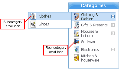
Small icons are used in the categories menu for some of the layout schemes.
The following options are set on the Flyout Categories module configuration page:
Small category icon width: select the width of 16, 32 or 64 pixels. This is the size of the icon image which will be stored in the database. It might be a good idea to set the 64 pixels width here to store a larger image. Then you can set the icon width of 32 or 16 pixels in the options for the specific layout scheme.
Small category icon resize quality: the category icon image will be resized preserving normal, good or best quality. Please pay attention to the resulting file size as the images with best quality tend to be larger.
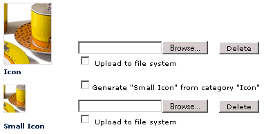
If the Flyout Categories module is enabled when you modify a category, one more option appears below the category icon selection option: category small icon selection.
Select the 'Generate "Small Icon" from category "Icon"' option to automatically generate small icons from the regular icons you have already selected. Leave the check box empty to be able to use different images for small icons.
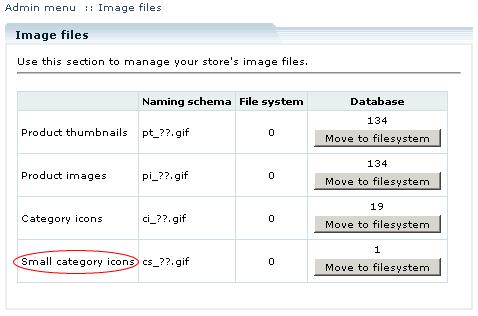
Small category icons also constitute a separate category in the 'Image files' section of the 'Maintenance' menu.
Scheme settings
There are four generic layout schemes available with several color solutions for each one. It is also possible to disable the module functionality by selecting 'None' from the 'Selected scheme' drop-down box. This way the layout of the Customer zone will not be affected, but the administrator is still able to make changes and configure the module settings. The following schemes are available:
Depending on which scheme you have chosen, options for the scheme vary. The set of existing options appears automatically when you select a scheme from the drop-down box.
Icons
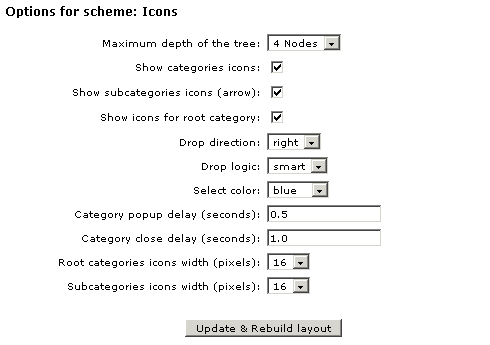
The following settings are available for the 'Icons' scheme:
Maximum depth of the tree: select depth from 1 to 7 nodes. This shows the possible number of nested categories.
Show categories icons: select this check box to display icons for categories next to the category names.
Show subcategories icons (arrow): select this check box to display arrows next to the names of the categories which have subcategories.
Show icons for root category: select this check box to display icons for root category names.
Drop direction: select 'right' or 'left' depending on where you want the menu to drop to.
Drop logic: select either 'smart' or 'fixed' drop logic. If 'fixed' is selected, the menus drop to the direction specified in the 'Drop direction' option, regardless whether there is space available or not. In this case a horizontal scroll bar appears if the resulting page width exceeds browser window width. If 'smart' is selected and not enough space is available (for example, at the side of the screen), the menu drops to the other direction, overriding of the 'Drop direction' option value.
Select color: select a color from the drop-down box. At least three color solutions are available by default for each scheme.
Category popup delay (sec.): set the number of seconds after which the nested categories expand.
Category close delay (sec.): set the number of seconds after which the expanded categories collapse.
Root categories icons width / Subcategories icons width: select the width of 16, 32 or 64 pixels. The settings override the 'Category small icon width' setting value, and the icon images are resized correspondingly.
